Overview | Cost | Designs | Bedroom | Hall | Kitchen | Dining Room | Kids Room | Puja Room | Bathroom | Lobby | Porch | Advantages | Ideas | Strips | Ying Yang | Abstract | Spiralling | Zig Zag | Petals | Bees | Triangles | Simple | Grids | Colours | Florals | Bold | Stars | Blues Browns | Conclusion
We buy houses, not homes. Homes are built with love, care, and affection by carefully curating every nook and corner of the space. Most modern homes nowadays use false ceilings to give a better look. But do you know what’s recently made a lot of noise in the interior designing industry? It’s the Plus Minus POP design.
If you are hearing the phrase for the first time, do not worry. We will give you a detailed description and various ideas of Plus Minus POP design to elevate your interior decor.
Also, read 9 POP Paint designs for every household personality.
An Overview of Plus Minus POP design
The term POP is an abbreviation for Plaster of Paris. Of course, we all know the Plaster of Paris, a ubiquitous building material even a few years back. However, with the modernization of civil engineering, the concept of using the Plaster of Paris as a coating after building a house has taken a backseat.
But POP is making a blockbuster comeback. Due to its versatile nature, you can now customize the POP using the Plus Minus design and use it in any part of your home. In addition, due to the product’s versatility, it gives interior designers enough freedom to customize every room with a particular theme or pattern.
The Plus-minus POP designs are gaining popularity in commercial spaces with very high ceilings. However, that does not imply you can’t have it in your home, like in the bedroom or living room. The easy-to-fit nature of the plaster of Paris has made it possible for architects and designers to give incredible looks to your spaces.
The modern look of the Plus Minus POP design instantly attracts people’s attention. Moreover, a stylish POP design sets a theme for the whole space, and you can curate and arrange the furnishings accordingly.
How Costly Can a Plus Minus POP design get?
When we think of doing some interior designing, the first thing that comes to our mind is the amount of investment it requires. We understand when you walk into a posh hotel or some high-end apartment, the looks of the reception make us wonder how much money they have put into its construction.
You need to remember one thing when considering using Plus Minus POP design for your home. You will be building a home, not a hotel. Therefore, so many eye-catching lights and intricate designs are not necessary.
It is simple logic. A complicated design will require skilled artisans and costlier materials. But, on the other hand, if you do not want something extravagant, you don’t need to worry about creating a hole in your pocket. All you need to do is think of some out-of-the-box designs and implement them in your plus-minus POP design, and you are good to go.
The cost does not just depend on the design but the area you cover as well. For example, the total cost may rise if you consider a large area with details like concealed lighting.
But again, if you plan it wisely and use shapes that are easy to make yet give an elegant look, you will have no problem creating a beautiful design.
You must remember the design you choose will be able to leave a mark only when you take care of certain parameters. They include shades of colours, shapes, and lighting. So give good thought to all these aspects when planning for a plus minus POP design.
Choosing different Plus Minus POP designs for different rooms
Every room comes with a different vibe. Just like your bedroom is your haven, your living room is open to all. So, create a different theme for every space. Here we have jotted down a few ideas you may implement in different rooms of your property.
1. Plus Minus POP design ideas for Bedroom
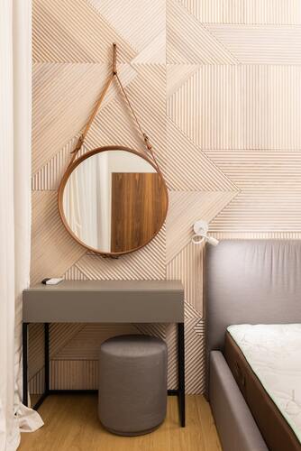
The bedroom is one of those rooms that require a softer touch paired with some warmth. Since it’s the place you will be returning to after working for the whole day, it should be able to give a cosy feeling.
The best choice of colour for bedrooms is pastel shades. Pastel shades mean colours like light blue, baby pink, light yellow, sea green, and many more. These colours provide a very aesthetic vibe when you put them up with some beautiful Plus Minus POP designs.
To pair the colours with the rest of the room, try using linens and curtains of the same colour but a darker shade. This is one of the most clever ideas to create a theme in a particular room.
You can look for unique Plus Minus POP designs in your bedroom. One thing you need to remember when deciding on your bedroom design is that it should have more curved lines than straight ones. Curved lines create a sense of a softer feeling than straight lines. It’s more like a psychological impact that interior designer’s often use to create mind-boggling designs.
2. Plus Minus POP design ideas for the Hall
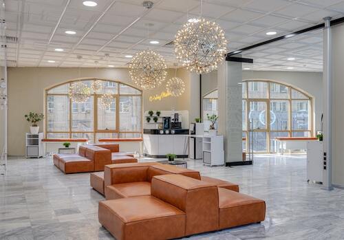
Whenever a guest comes to your home, your hall is where you first make them sit. Even if they are your very close friends or relatives, we do not take them to our bedrooms directly. The reason is that the hall is more like a place for all. So you need to create a stunning look for the hall, even if you prefer a low-key decoration for the rest of the rooms.
If you want your visitors to pay attention to the design of your hall, you need to make it something eye-catching. One of the simplest methods of doing that is by pairing a Plus Minus POP design with a stunning chandelier. A beautiful chandelier always stands as a signature piece for a space, and when used with a Plus Minus POP design, it adds a different volume.
The most popular POP design for the hall is the tray. The multiple layers that it has gives the impression of a tray. Another popular hall design is false, along with a cornice pattern. It is a very decorative choice that you can opt for if you want a stunning makeover of your hall.
3. Plus Minus POP design ideas for the Kitchen
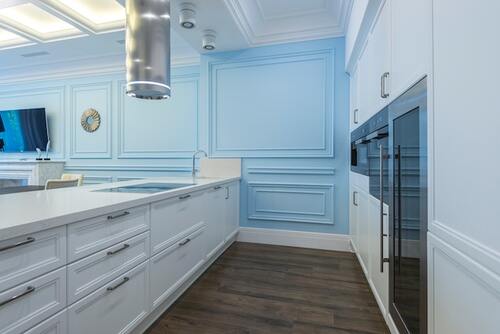
Kitchen is the place where the magic happens. But most of the time, if not always, it is the most ignored part of the house in terms of design. Instead, people focus more on the hall and bedrooms than the kitchen makeover.
But times have changed. The latest apartments and houses have spectacular designs, even for kitchens. But there are a few things you need to remember regarding kitchen designs.
Preferably try to abstain from using very intricate Plus Minus POP design for your kitchen. This is important since, mainly in Indian kitchens, a large amount of food requires oil usage, and the walls and ceilings are deposited with tiny oil droplets. These droplets attract dust and ultimately stick to your walls and ceilings, making cleaning difficult.
For the alternative to complex designs, you can simply opt for some simple stripes or geometric patterns plus minus POP designs. You can also add a false ceiling to hide all the extra wirings and pipes that often run along the ceilings. Finally, pair these alternatives with some bright lighting, preferably yellow or white coloured, to complete the look of your kitchen.
4. Plus Minus POP design ideas for the dining room
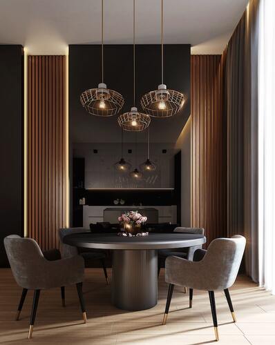
After perfecting the kitchen look, the next thing we need to focus on is the dining room. It is a place where all the family members sit together at least once a day to talk while indulging in some healthy homemade food. Having the proper lighting to set the mood after an exhausting day is essential.
One of the dining room’s most famous plus minus POP designs is the two-layered structure with recessed lights. The lights are hung at different levels to create a beautiful gradient and provide an aesthetic environment to the space.
You may be surprised to know it is unnecessary to use matching lampshades. You can choose various multi-coloured lamp shades and hand them according to your preferences. You must remember to hang lights, especially above the dining table, to mark the signature piece of the room.
You can also use designer plates on the walls with plus minus POP designs. Stripes or geometrical shapes look great when you hang decorative plates on them. Try collecting multi-coloured designer plates to enhance the look of the place.
5. Plus Minus POP design ideas for Kids Room
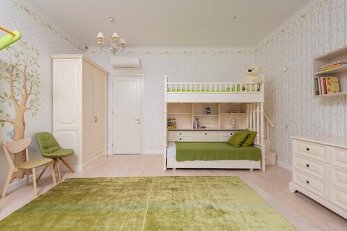
It is crucial that you design the room for your little ones carefully. We understand that it may seem like a dull idea to design it since you need to do a whole makeover when they grow up. But trust us, if you use the Plus Minus POP design correctly from the beginning, you will not be required to go for a complete change after a few years.
Be it a boy or a girl of any age, softer colours and floral patterns or bolder shades with geometrical patterns apply to all. But yes, if you are thinking of using specific motifs like cars or dolls, then you need to plan the whole Plus Minus POP design wisely.
For example, you can use the colour palate from their favourite characters without actually implementing the motifs themselves. Like if your child is a fan of the hulk, try different shades of green with the Plus Minus POP design and add some Hulk wall stickers to enhance the look.
If your kid is into Marine animals, try hues of blue and use stickers accordingly to create the look. Then, after a few years, when they grow, and their tastes change, you can remove the stickers, and you will again have an empty canvas where you can create your own magic.
6. Plus Minus POP design ideas for Puja Room
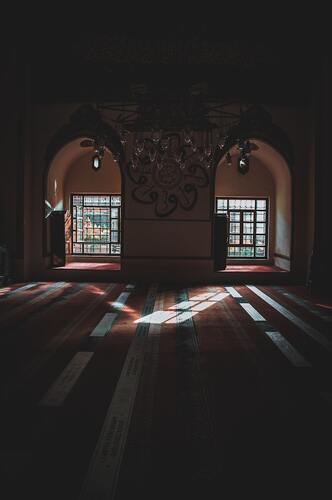
Puja room is an essential part of the house, especially in Indian households. Even people who cannot afford large apartments with multiple rooms keep a small wooden temple with pictures of all gods and goddesses inside one of the rooms. But if you have a room dedicated for the purpose of then, you should use the Plus Minus POP design to elevate the look.
The Puja rooms are often constructed in a place that is the centre of our homes yet secluded from the hubbub of the place. So you can definitely create beautiful ornamental ceilings with extravagant Plus Minus POP design.
One of the lavish designs for the Puja room can be recreating a scene from the Mahabharata like the war. But this is recommended if you have sufficiently large space for your Puja Room, or it will look congested.
However, per most of the room sizes allotted for Puja in our country, you can avail of simple designs. For example, motifs of flowers, bells, leaves, etc., can be a great choice on a white background. Since white signifies peace and, at the same time, makes the space looks large, it is an excellent choice of colour for the Puja Room.
7. Plus Minus POP design ideas for Bathrooms
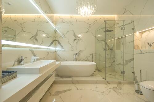
If you think the Plus Minus POP designs can only be used for all the spaces in the house except for bathrooms, think again. Using the right design and colours can transform a simple bathroom into an elegant one.
When you walk into a hotel, most of us like to check the bathrooms first. The reason for this is not just cleanliness; a beautiful bathroom creates an impression of sophisticated choices.
If you are thinking of ideas for Bathrooms, then using Plaster of Paris cones, curves, swirls, or even waves is a great idea. Also, try to choose pastel shades since they give the impression of a more oversized bathroom and a large mirror.
The mirror hacks work amazingly, especially for the smallest spaces, not just bathrooms. For example, hanging a large mirror in your sitting area will make the entire apartment look considerably larger if you have a small apartment.
For larger bathrooms, you can think of using accents that are brightly coloured to elevate the overall look of the space.
8. Plus Minus POP design ideas for Lobby
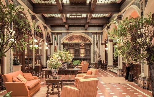
When people enter your home or apartment, they first walk through your lobby. And we all know about the famous quote, “Your first impression is your last impression.” Even though your guests are not clients from your workplace, the impression matters for everyone.
You can design the lobby with a beautiful intricate Plus Minus POP design and add some metal structures to it. Scones, metal framed mirrors, small brass showpieces, etc., are readily available in the market, which you can add to this place. You also put hand-painted pictures to create a cosy and homely vibe right from the entrance.
For the lobby’s colours, try choosing yellow or orange hues. These colours signify warmth and are pretty welcoming, creating a beautiful aesthetic of the place.
9. Plus Minus POP design ideas for the Porch
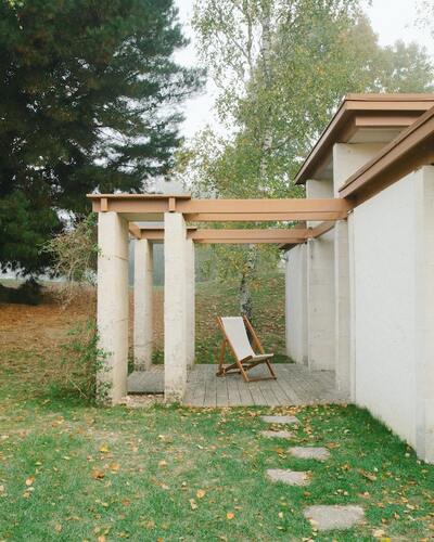
Porches or Verandas are outside spaces and do not require a false ceiling.
But does that mean you do not get to decorate the place? Absolutely not!
You can implement some pretty fundamental latticework patterned of Plus Minus POP design. To elevate the overall look of the porch, you can also think of adding a pillar or a few arches. These often give an old traditional look, and if that overlooks a garden or backyard, it would be the perfect marriage.
Advantages of Plus Minus POP design
There are multiple advantages of using the Plus Minus POP design ideas for your home. Some of them can be:
- The designs are highly durable. We are all aware of the durability of Plaster of Paris from looking at houses made in the last few decades. In the same way, since the Plus Minus designs are made of POP, you do not have to worry about the durability factor.
- They stay as it is. This is one of the critical aspects of the Plus Minus POP design. All of them stay almost in the same state for years to come.
- This is a perfect way to hide all those wirings and extra pipes in your homes. You can also use it to conceal the ceiling damages that may have developed for multiple reasons.
- All the Plus Minus POP designs are extremely low maintenance. However, they are highly weather resistant, providing insulation for both heat and cold.
- This is the most pocket-friendly way to improve the overall look of your place.
Some Plus Minus POP Design Ideas You Can Choose
1. Stripes All the way

Stripes have always been people’s favourites; many love using them, even in bedrooms. A perfect Plus Minus POP design choice for kitchen or dining rooms is the stripes. Opt for some shades that are easily distinguishable from one another and use them parallelly to give your rooms an artistic touch.
2. Black and white and some Ying Yang
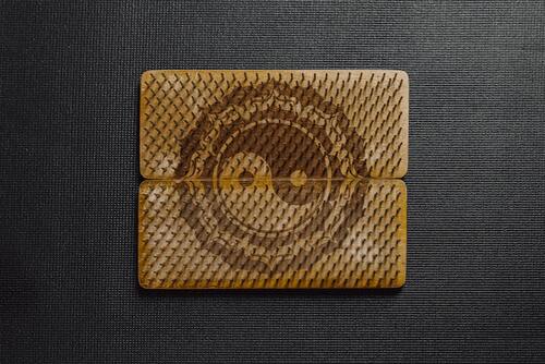
A classic black and white Ying yang design is an excellent choice for the sitting area. You can put circular lights in the black and white regions for the perfect look. White light perfectly matches a Ying Yang Plus Minus POP design.
3. Go Abstract
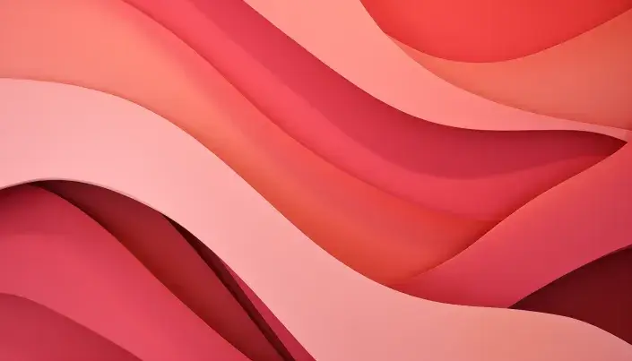
It is not always necessary to choose a particular design or pattern. You can always opt for some abstract pattern in solid colour background. Choose a lighter shade of colour for the walls with an abstract design and deck it up with some spotlights from the ceiling.
4. How about some Spiralling?
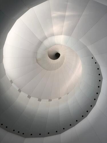
Spirals are a great way to elevate the look of a space. However, this Plus Minus POP design is recommended for large spaces with high ceilings. In a small area, you won’t be able to visualize the true beauty of this design. It’s best if you implement it in the lobby or living room.
5. The Zig Zag look

This is one of the most straightforward Plus Minus POP designs to use in your apartment. Due to the pattern’s versatility, you can use it in any of your rooms by adjusting the hues of the colours. For example, you can use some vibrant colours to alleviate the look of your lobby or sitting space.
6. Increase the aesthetic value with some petals
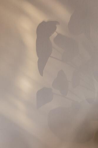
The petal Plus Minus POP design is especially recommended for large spaces like a hotel lobby or restaurant. However, you can also use this in the ceiling of your hall if there is sufficient space available. Due to the shape of the petals, the bigger the size, the better its elegance.
7. Get inspired by the bees
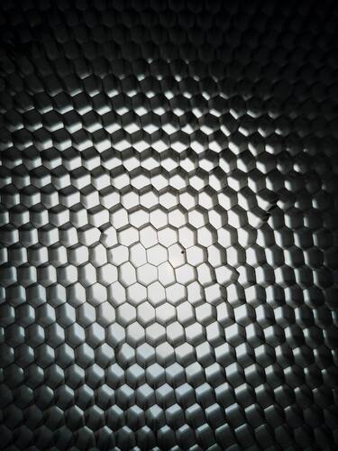
The honeycomb is a pretty Plus Minus POP design that can easily be used in your hall’s ceilings. Depending on the space availability, you can increase or decrease the size of the honeycombs accordingly. You can also add small concealed lights within these honeycombs, and it would look simply spectacular.
8. Use triangles
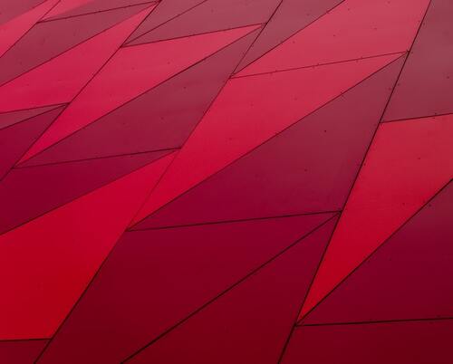
Triangles do not simply mean some flat two-dimensional shapes. You can also use numerous triangles to create pyramids and make offbeat designs on the walls. This Plus Minus POP design is quite popular, and you may find it in various furniture stores or expensive restaurants and hotels.
9. Go simple
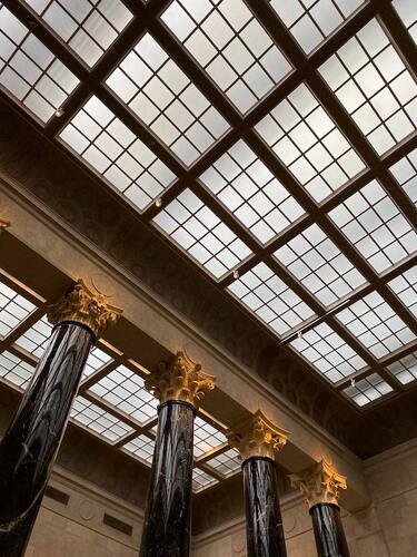
It is not essential to always have an extravagant Plus Minus POP design. A simple grid is enough to serve the purpose of concealing ceiling damages or wirings and pipes. The simple grid can be your best choice if you want a budget-friendly option.
10. Alleviating the Grids
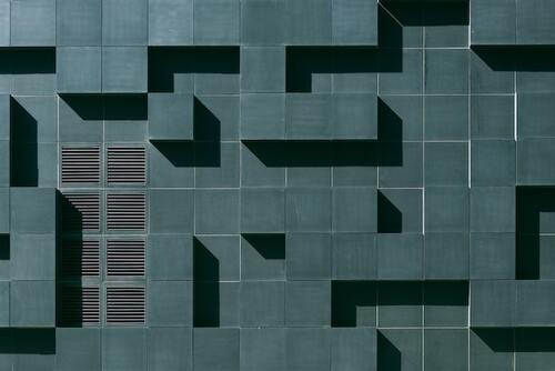
If you are looking for something in the grid pattern but with a more artistic touch, the little boxes on the ceiling are your best call. Choose any monochromatic shade and pair it up with matching lights to complete the look of the entire space.
11. Use colours
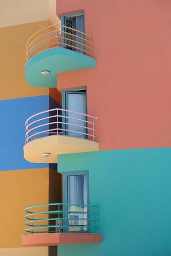
The most ingenious way of using Plus Minus POP design is by implying contrasting shades. Use simple geometric patterns on the ceilings or walls and blend them with bold contrasting colours. The overall vibe of the place changes in an instant.
12. Traditional Florals
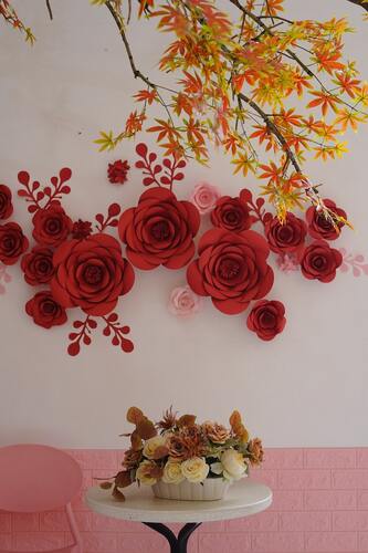
Looking at the old historical architectural buildings, you will find the extensive use of floral patterns. This pattern is still used today due to yeh versatility of this Plus Minus POP design. You can use an intricate floral pattern on the wall or ceiling, your hall, or a simple design for your bedroom.
The ease of using the design wherever you want makes it one of the most popular choices among individuals.
13. Some bold Blacks and Whites
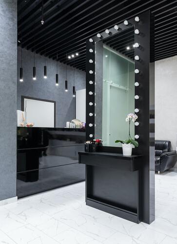
You may not consider black an option for colouring your ceilings or walls. But times have changed, and various hues of blacks are paired with white or off-white shades to create some magical Plus Minus POP designs. In addition, you can add bright led lights onto them to decrease the amount of light absorbed due to the black colour.
14. Get stars on your ceilings
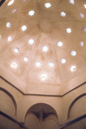
This design is also inspired by old architecture. Massive stars in the ceilings had been a popular choice in palaces and monuments. You can use this Plus Minus POP design with peach or earthy colours to create a royal vibe at your place.
15. Blues and Browns

It might not seem like a perfect idea if you try to visualize blue and brown together. But this combination has been used in the Moroccan and Mediterranean cultures for ages, and they look simply spectacular. Using some intricate Plus Minus POP designs and colouring them with shades of blues and browns are a fantastic choice for a hall or living room.
The Bottom Line
Apart from the Plus Minus POP design ideas shared above, there can be numerous others. It is not necessary to choose from one of these ideas when you are looking for some inspiration.
Due to the versatile nature of the Plus Minus POP design, you can create any design of your own. Use a colour wheel to choose the perfect shades that would complement each other when used together.
Do your research correctly or get in touch with an interior designer before implementing any changes. You must never forget your home should be your happy place, so do not spoil its beauty by finishing the design in a hurry. Take your time and create your masterpiece!
